Lhotce: A Display Font That Elevates Digital Branding
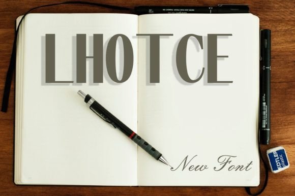
Lhotce is a refined display font with graceful curves, subtle contrast, and an elegant rhythm that feels both contemporary and timeless. Its letterforms balance softness and structure—slightly condensed proportions, open counters, and gentle stroke modulation make it highly legible at larger sizes while retaining distinctive character. As a web designer who selects typefaces for real-world digital products, I reach for Lhotce when I need a font that communicates sophistication without sacrificing clarity or intention.
Unlike overly ornate script fonts or rigid geometric displays, Lhotce sits comfortably in the sweet spot between expressive and functional. It’s not built for body text—but that’s precisely its strength. In digital interfaces, display fonts like Lhotce serve as visual anchors: guiding the eye, reinforcing tone, and creating memorable moments of recognition. Whether you’re designing a boutique online store, launching a creative course, or building a SaaS landing page, Lhotce delivers impact where it matters most—headers, hero sections, branded banners, and call-to-action overlays.
For hero sections, Lhotce shines at scale. On desktop, it reads cleanly at 48–96px with generous letter-spacing and tight line-heights to preserve vertical rhythm. On mobile, I recommend using it sparingly—only for primary headlines—and pairing it with a responsive font stack that switches to a robust sans serif (like Inter or Manrope) below 768px. This ensures hierarchy remains intact across devices without compromising load performance or readability.
Lhotce works especially well in conversion-focused layouts. On product landing pages, it adds warmth and distinction to headline copy like “Design With Purpose” or “Your First Course Starts Now”—phrases that benefit from typographic personality. In e-commerce banners, it helps differentiate premium offerings: think “Limited Edition Kit” or “Handcrafted Collection” overlaid on lifestyle imagery. Because its forms are balanced—not too light, not too heavy—it maintains contrast against both light and dark backgrounds, and even performs reliably over subtle image gradients when opacity is adjusted to 92–96%.
Brand identity thrives when typography reflects voice—and Lhotce supports a range of tones. It conveys quiet confidence for coaching sites, artisanal authenticity for handmade marketplaces, and editorial polish for creative blogs or newsletters. I’ve used it successfully in portfolio websites where the font appears only in the site title and section headers, letting project thumbnails and clean body copy carry the weight of content. The result? A cohesive, intentional experience that feels curated—not cluttered.
Readability isn’t just about size—it’s about context. Lhotce excels in short, high-impact phrases but shouldn’t be used for buttons smaller than 16px or navigation labels. Its charm lies in breathing room: give it space, and it rewards you with presence. Avoid stacking multiple weights or styles unless your license includes them—Lhotce’s value comes from consistency, not complexity. When used as intended—as a singular, confident voice in your typographic system—it strengthens brand recall far more than any decorative flourish ever could.
Font pairing is where Lhotce reveals its versatility. Pair it with a neutral, highly legible sans serif like Inter, IBM Plex Sans, or Open Sans for body copy and UI elements. The contrast between Lhotce’s organic flow and the sans serif’s functional clarity creates natural hierarchy and improves scanning behavior—users instantly know what’s a headline versus what’s actionable text. For editorial or luxury-facing sites, try pairing with a crisp, low-contrast serif like Charter or PT Serif. That combination signals authority and craftsmanship without competing for attention.
Before implementation, verify your Lhotce license covers web use—including self-hosted fonts via @font-face, CDN delivery, and commercial deployment across client projects, online stores, and digital templates. Most premium display fonts like Lhotce include WOFF2 files optimized for fast loading, and many support Latin-based languages out of the box. If your audience includes multilingual users, confirm whether extended glyphs (e.g., accented characters for French, Spanish, or Polish) are included—or if a separate OpenType feature set is required.
In practice, Lhotce fits seamlessly into modern design workflows. It integrates cleanly with Figma auto-layout components, works with CSS font-display strategies (swap recommended), and scales predictably in CSS Grid and Flexbox containers. I often define it as a custom property: --font-display: 'Lhotce', 'Inter', sans-serif;—then apply it selectively to , , and elements where tone and emphasis matter most.
What sets Lhotce apart isn’t novelty—it’s restraint. In an era of flashy variable fonts and AI-generated type experiments, Lhotce offers something rarer: thoughtful execution. It doesn’t shout. It invites. And in digital experiences where user attention is fragmented and trust is earned in milliseconds, that kind of quiet authority makes all the difference.
If you're curating a font library for client work, personal branding, or scalable digital products, treat Lhotce as a strategic asset—not just another display font. Use it to signal quality before a single word is read. Let it reinforce your brand’s values in the space between letters. And always pair it with intention: one strong voice, supported by clarity.